As a coder (both professionally and for fun), I spend a lot of time looking at monospaced text on a computer screen. Using a good font is important to me because it helps in concentration and reduces fatigue. I tried different fonts, and settled on Jetbrains Mono for my IDE and text editor, and Iosevka for the terminal.
What makes a good font? Link to heading
A unique character Link to heading
A good font for coding should have clear distinctions between characters, for
example it should be clear that a 0 is not an O, and which is the zero and
which the capital O. Another example is 1 and l. This is important because
in code, it is not always clear from the context if something is a number or a
letter, and computers are very picky. If you ever typed in a long WiFi password
a couple of times before realizing that zero was actually a capital O, you know
what I mean.
All widths are equal Link to heading
Coding fonts need to be monospaced, meaning that all the characters are equal width. This helps because in code, every character is equally important to get right, and it also helps a lot in lining up lines of code vertically to keep it legible.
The power of invisibility Link to heading
When coding I need focus and concentration. If a font has even a few quirks in legibility or feels unbalanced, it distracts me from what I am doing.
That’s what I mean by invisible; I need to be able to look through the font, only at the information that it conveys. It’s a bit like looking through a clear window, and suddenly your eye re-focusses on a little smudge on the glass. You lose your train of thought and are suddenly focussed on removing that irritating spot.
Ligatures are good/bad Link to heading
Ligatures are multiple characters combined into one. A well known example from printing is that the character f and i are combined into one fi character, like the example below:
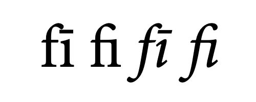
Examples of a ligature; two characters melted into one
For coding, a font can support ligatures for stuff like arrows etc, as seen below in the popular Fira font.
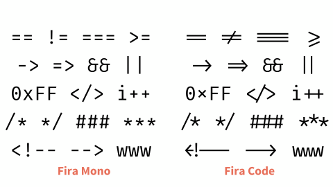
Fira without ligatures (left) and with ligatures (right)
Ligatures are controversial among coders; they hide the exact characters you typed behind another representation, which doesn’t sit well with some coders. I understand that, but I do use them because to me, it does make the code look more elegant and readable.
Not all fonts support ligatures. If the font you like does not support it, you can go over to nerdfonts.com and see if they have a patched version of your favorite font with the ligatures added to it.
Selecting a font Link to heading
When you use a text editor or IDE for coding, it is usually pre-configured with a monospaced font, so you’re good to go. But if you think things could be better, a good place to try is programmingfonts.org. You can try out more than 100 programming fonts in your browser and see which one you like best.
My choice: Jetbrains Mono and Iosevka Link to heading
After trying different options (not considering the payed options by the way), I settled on Jetbrains Mono. Before Jetbrains released this font, I was using Source Code Pro by Adobe, which is also fine.
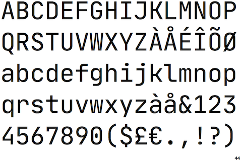
Jetbrains mono
I also came across Iosevka, which I find a little too narrow for coding. But it is perfect for use in my terminal, where I want to cram in as much text as I can. I really like the legibility and balance of this font.
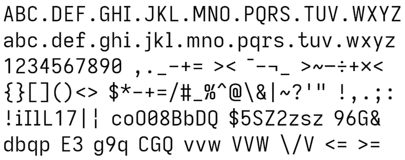
Iosevka
If you are using Homebrew on macOS, like I am, you can install both these fonts with:
brew install font-jetbrains-mono font-iosevka